How to Turn Data into Visual Stories
Tell Cohesive Stories with Data
Storytelling enabled our ancestors to pass along knowledge and develop cultures. As humans, we also developed an eye for identifying patterns, but it wasn’t until recently in our evolutionary history that we started describing the patterns we see using data and statistics. It’s perhaps one reason why some of us find interpreting numbers and statistics unintuitive.
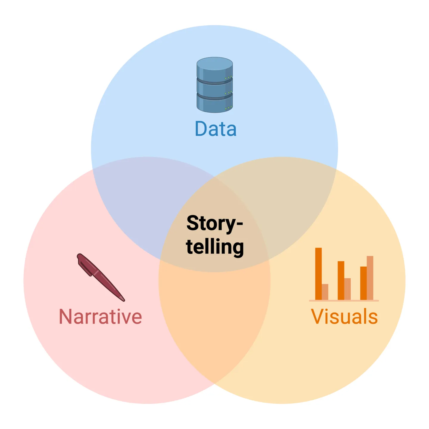
Tell cohesive stories with your data using BioRender Graph. Learn more today.
As you interpret your own data and decipher the hidden story, you have an opportunity to relay this narrative in a cohesive and compelling way to your audience that avoids rehashing the interpretive work you’ve already done.
Consider these 3 key tips when using multiple related sources of data to communicate your scientific story:
1. Define a clear storyline
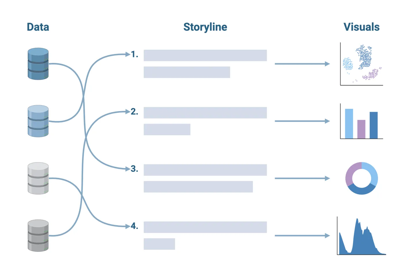
Once you’ve deciphered your data, outline the narrative you want to convey. This should be done before creating any visualizations. Clearly defining your key message or insight will help you select the appropriate visualizations to use, as well as the sequence in which they should be presented. Think of this as the storyboarding step in writing a compelling novel.
2. Use consistent design elements
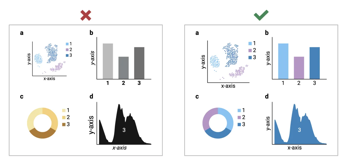
Your story should have a unified look and feel. Consider shared design elements across your visualizations and ensure that they are consistent. This could include graph axes lines, text size and formatting, color palette, and symbols. Consistency enhances readability and makes it easier for your audience to connect various elements and data points within your visual narrative. For example, you should ensure consistent color-coding if the same experimental groups are represented across multiple analyses.
3. Add context with effective labels and annotations
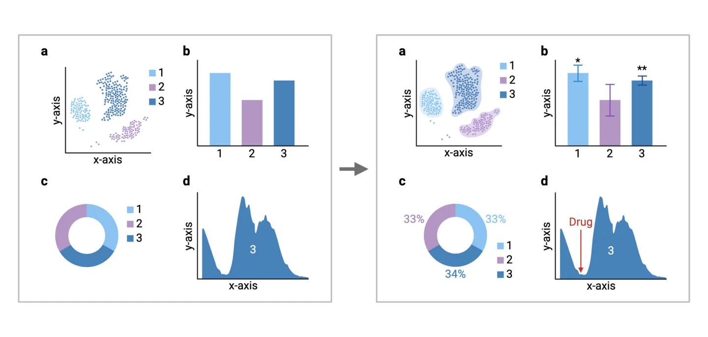
To guide your audience through the story, consider incorporating meaningful annotations and labels for added context. Clearly label data points, highlight key trends, and use annotations to explain significant fluctuations or outliers. Well-placed labels can serve as signposts, directing attention to critical details in your data.
BioRender Graph tip
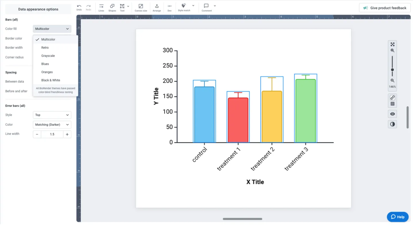
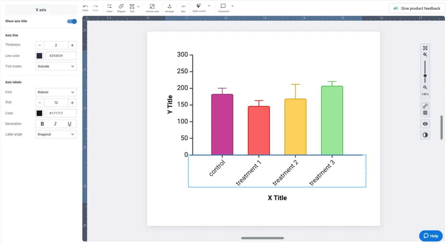
To help you create cohesive graphs, BioRender Graph has easily accessible color presets. Simply click on your whole dataset and choose your preferred theme from the “color fill” drop down. Note: all of our preset themes are optimized for accessibility and are color-blind friendly.
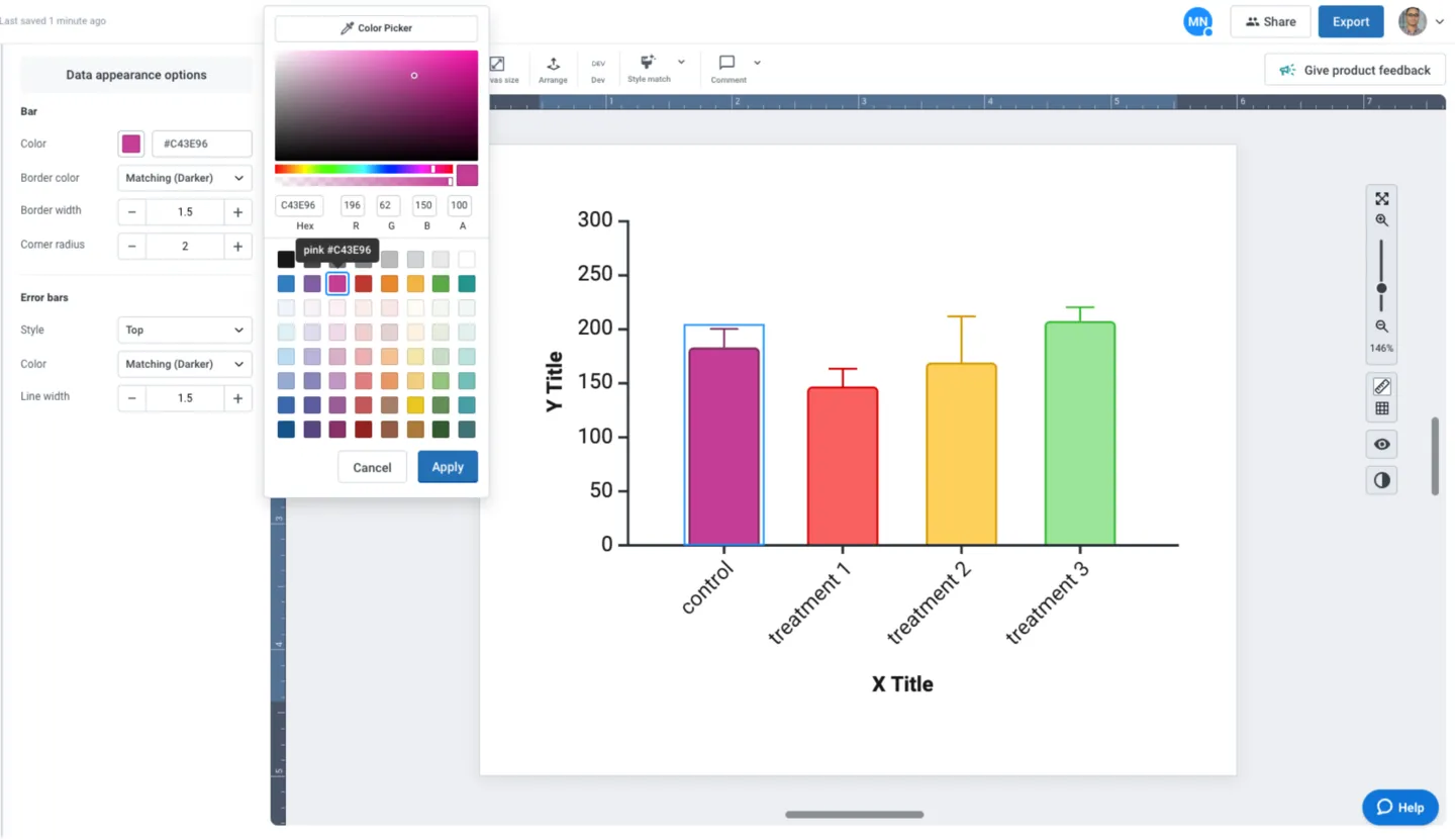
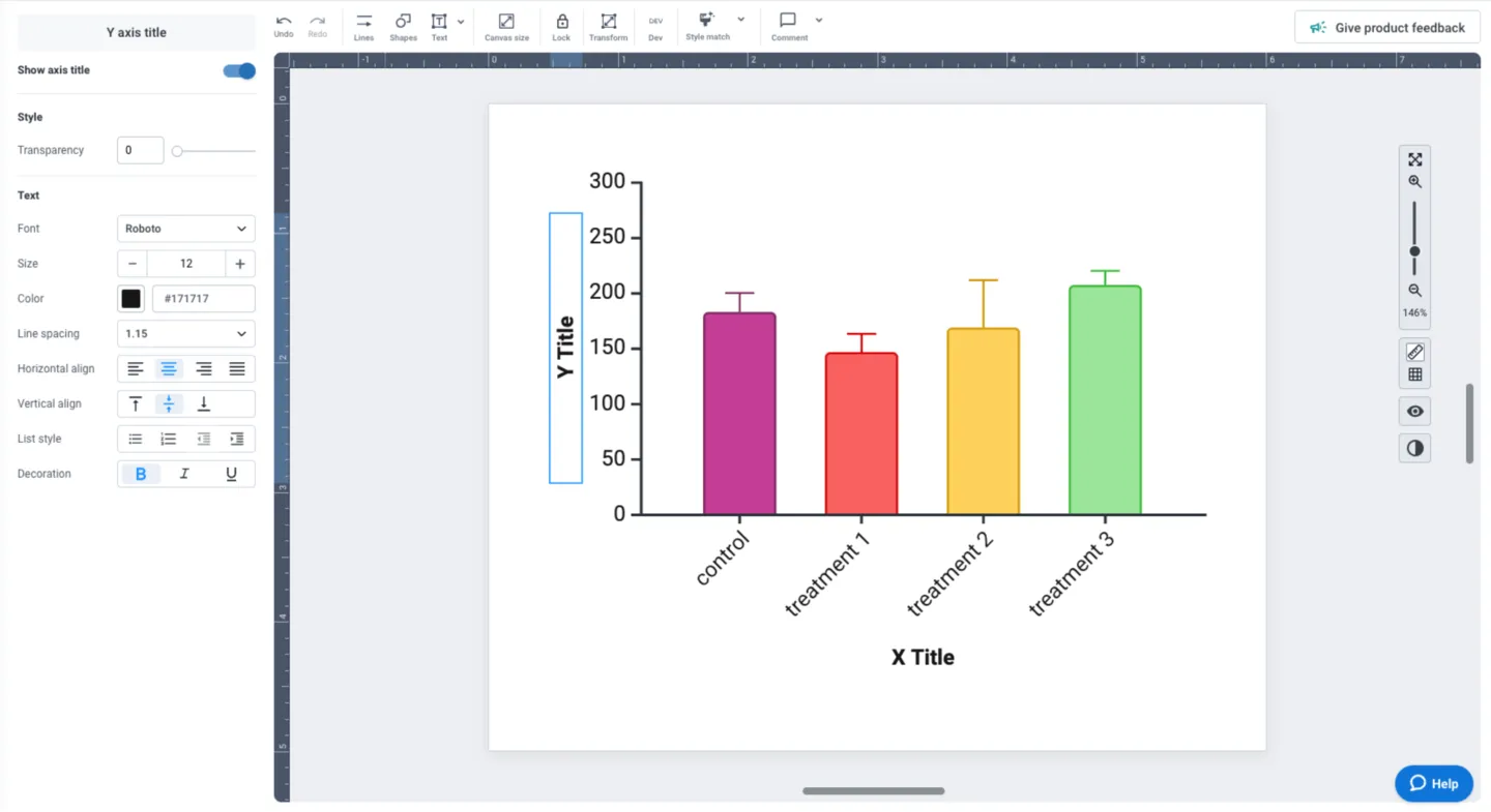
Need to use specific colors or can’t find a theme that you like? Simply click on individual data groups and select the color that works for you. Border color can be set to match your selection, or you can select a black border. The left panel also allows you to adjust border width, corner radius (curvature), and error bar styling.
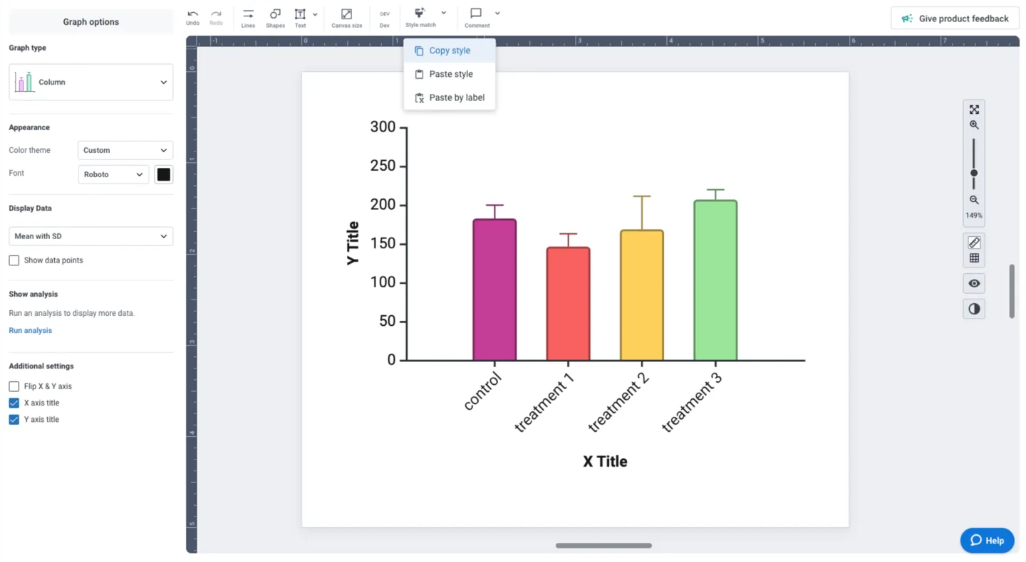
Now that you’ve customized your graph, you can easily copy the style with one click using the “Style Match” feature. Leverage this time-saving feature to copy and paste your custom style across multiple graphs to ensure that your data storytelling is consistent and cohesive.
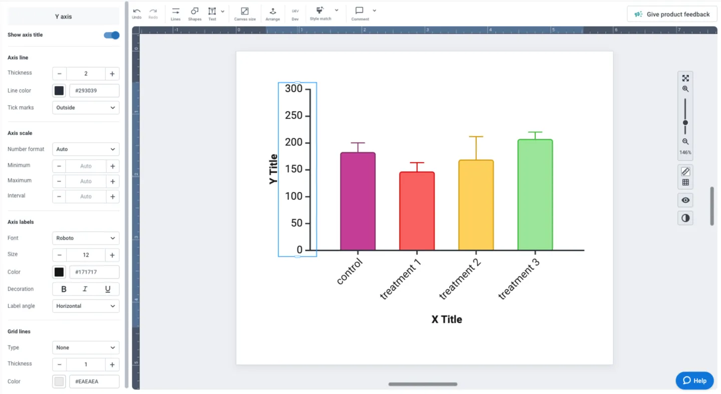
Customizing and editing any part of your visual is one click away in BioRender Graph. Clicking on any of the elements (axes, labels, data, etc.) populates the left panel with all the tools you need to make your adjustments and ensure your data storytelling is beautiful and consistent.
How to Visualize Proportions
Proportions are datasets that represent part-to-whole relationships. A set of proportions adds up to 1, and a set of percentages add up to 100%. In either case, the goal of visualizing proportions is to show the individual parts relative to other parts while maintaining a sense of the whole. This section discusses ways of visualizing proportions, while guiding you to choose the right type of chart for your data.
Pie Charts
Many scientists will be familiar with pie charts as the default option for representing proportions. The circle of the pie chart represents the whole, and wedges sliced out of the pie represent the individual parts of the whole.
When to use pie charts
- Few parts (or slices) that add up to the whole
- The size of slices are not too similar to each other
- Relative differences are more important than exact values
- Proportions are static (single time point)
Limitations of pie charts
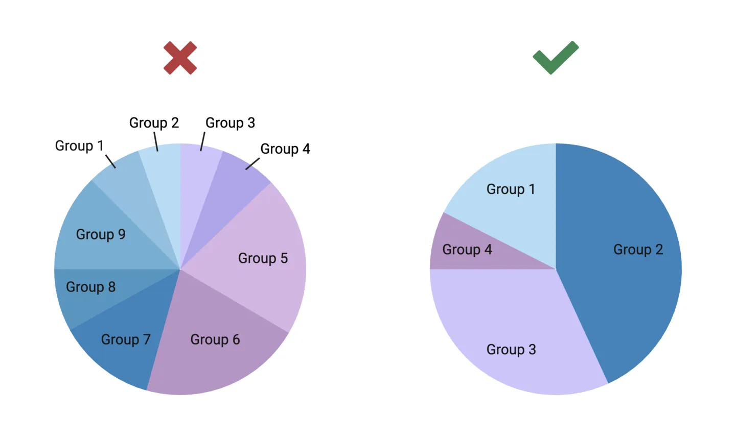
- Too many slices make pie charts difficult to interpret (shouldn’t be more than 5 slices)
- Relative differences can be misinterpreted if slices are similar in size
- Cannot represent changes in proportion over time
- Can only represent one group
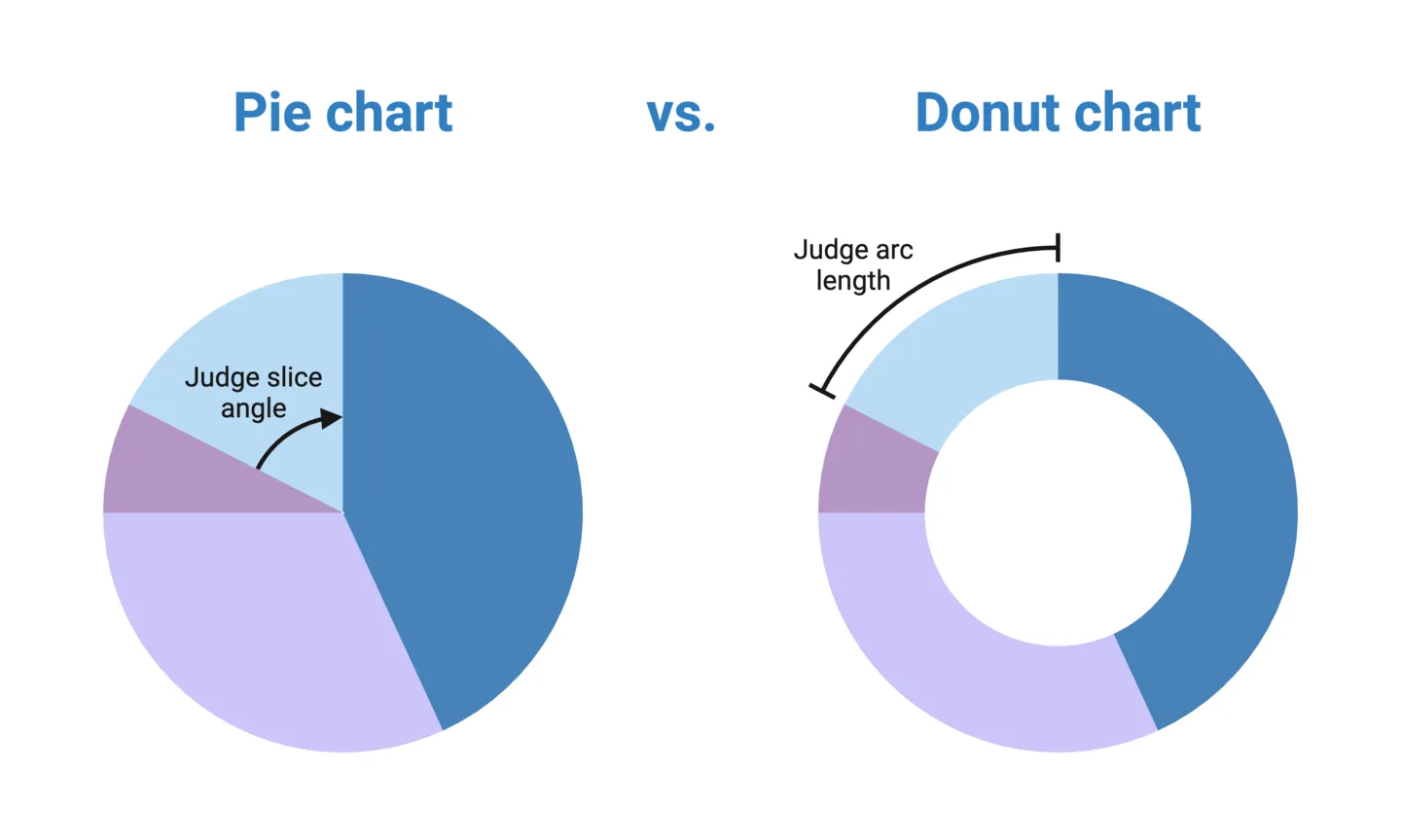
- Relies on visually judging angles, which is more difficult than comparing length (in a bar chart, for example)
Donut Charts
A donut chart is simply a pie chart with hole in the middle, making it look like a donut. This solves one of the key limitations of pie charts: having to judge relative difference based on slice angles. Instead, donut charts visually guides you to judge differences based on the arc length of a part, which is much easier than judging angles. Because of this, we generally recommend using donut charts rather than pie charts.
When to use donut charts
- Few parts that add up to the whole
- The size of parts are not too similar to each other
- Relative differences are more important than exact values
- Proportions are static (single time point)
Limitations of donut charts
- Too many parts make donut charts difficult to interpret (shouldn’t be more than 5 parts)
- Relative differences can be misinterpreted if parts are similar in size
- Cannot represent changes in proportion over time
- Can only represent one group
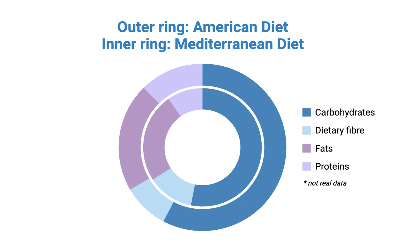
Tip: donut charts also free up real-estate to enable nesting! Nested donut charts allow you to compare groups in your dataset and more directly than having side-by-side donut or pie charts. See the example below:
Stacked 100% Column Charts
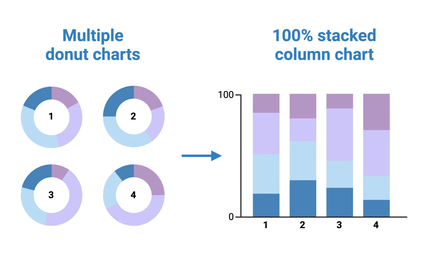
Donut charts can be effective and simple way of representing proportions when you only have one or a few groups. For example, showing the relative caloric contribution of each macronutrient in the typical American diet, or comparing 2-3 regional diets using nested donut charts, as mentioned above. But suppose you want to make this comparison across 4 or more regions. In this case, nesting donut charts may no longer feasible (or at least, not advised). Another option is to create separate donut charts for each group, but this can make it difficult to interpret how regions compare to each other.
A stacked 100% column chart effectively unfurls a donut chart into a column, with the added benefit of allowing direct side-by-side group comparisons along the x-axis. Because it’s a 100% column chart, the stacked parts of each column still add up to 100%, allowing for within-group relative comparisons just like an individual donut chart.
When to use stacked column charts
- Few parts that add up to the whole
- The size of parts are not too similar to each other
- Relative differences are more important than exact values
- Proportions are static (single time point)
- Multiple groups are being compared
Limitations of stacked column charts
- Too many stacked parts per column make it difficult to interpret (shouldn’t be more than 5 parts)
- Relative differences can be misinterpreted if parts are similar in size
- Cannot represent changes in proportion over time
Stacked 100% Area Charts
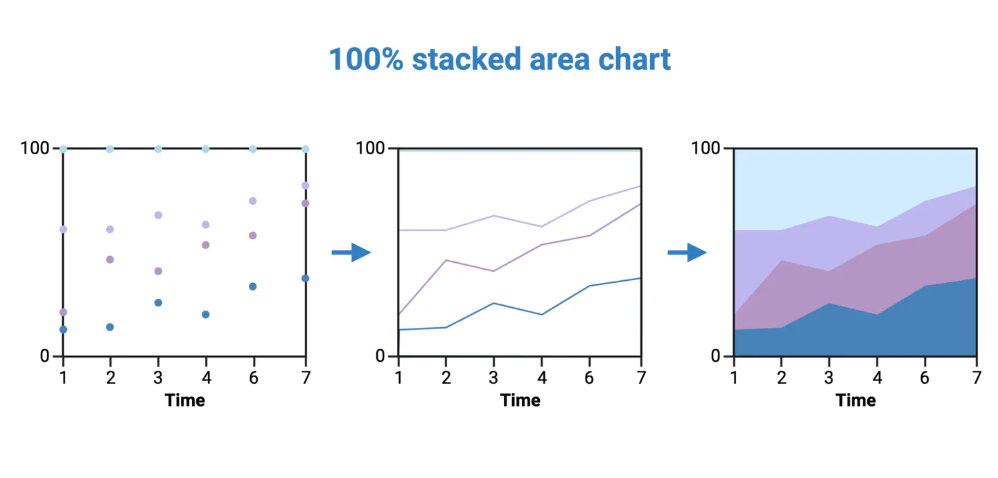
Pie charts, donut charts, and stacked 100% column charts all share the limitation of representing static proportions. In some cases proportions need to be represented over time. For example, showing the relative caloric contribution of each macromolecule in the average Canadian diet by decade. In cases like this, a stacked 100% area chart should be used.
To construct a 100% stacked area chart for the above example, plot the percent caloric contributions of each macronutrient as stacked points for each decade. Then, connect those points to create a stacked time series for each macronutrient. Fill the empty spaces between each time series. Now, if you take a vertical slice of the area chart, you would get the distribution of that time slice.
When to use stacked area charts
- Few parts that add up to the whole
- Relative differences are more important than exact values
- Proportions change over time (many periods)
Limitations of stacked area charts
- Too many stacked parts per time point make it difficult to interpret (shouldn’t be more than 5 parts)
- Can only represent one group
How to Visualize Relationships
Many scientific questions can be answered by analyzing the relationships between groups or variables. What are the similarities between groups? Within groups? Within subgroups? How does one variable influence another? Let’s dive into how we visualize relationships, and some key considerations.
Correlations
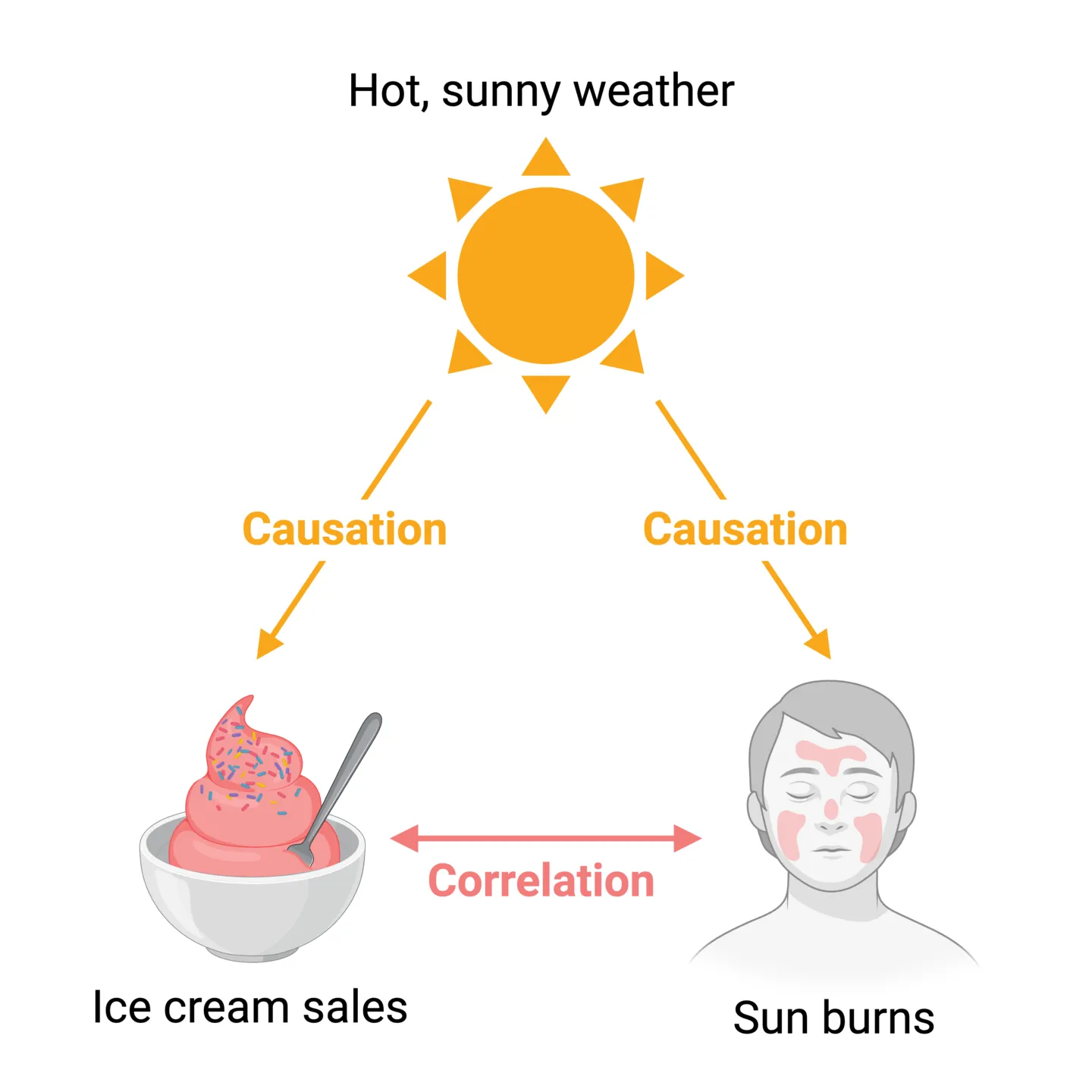
Correlations describe relationships where one variable tends to change a certain way as another variable changes. Therefore, correlations are useful in helping predict one variable by knowing another. However, it’s important to be careful when interpreting correlations. As the old mantra goes: “correlation does not equal causation”. For example, there is a simple positive correlation between the ice cream sales and sun burns- as one goes up, the other one also tends to go up. But this is distinct from saying that changes in ice cream sales cause changes in sun burns, or vice versa. With this in mind, let’s consider our main visualization methods for representing correlations.
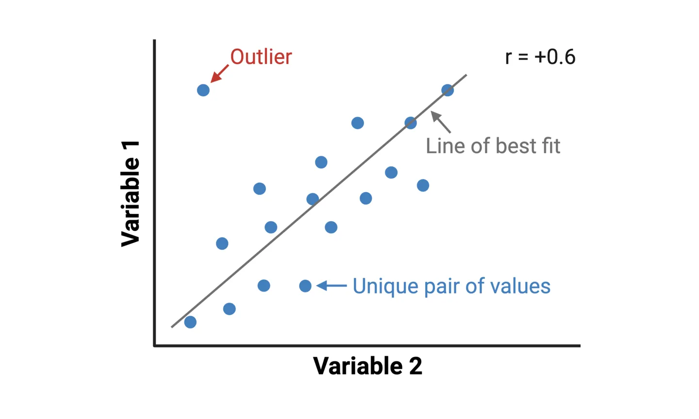
Scatterplots are the most popular way of representing simple correlations. A scatterplot is constructed by plotting individual data points on a two-dimensional plane, with one variable represented on the x-axis (e.g. ice cream sales) and another on the y-axis (e.g. sun burns). Each point corresponds to a unique pair of values from the dataset (e.g. one point would represent ice cream sales and sun burns for a certain month of year). In addition to showing the correlation between variables, a scatterplot also shows patterns such as clustering and outliers.
Tip 1: Using statistical software, a line-of-best-fit can be added to a scatterplot, which enhances the visualization by representing the relationship with a single line. A Pearson’s correlation coefficient (r) is a statistical measure that reflects the ”noisiness” of data points and direction of correlation.
Tip 2: Regressions are often confused with correlations. Whereas correlations describe the relationship between 2 variables, a regression describes how a independent variable causally affects a dependant variable. For regressions, a coefficient of determination (r^2) provides the proportion of variation in the dependent variable that is predictable from the independent variable.
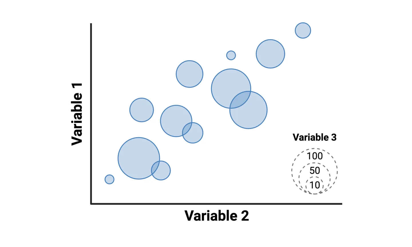
Bubble charts allow you to add one more variable to a scatterplot. Instead of representing each the pair of values for the two main variables as a point along the x- and y-axes, they are represented as circles with the area corresponds to a third variable. For example, you can create a correlation scatterplot of treatment effectiveness vs. adverse effects across clinical trials, where the circle area of each value represents the number of patients in each trial.
Distributions
A distribution represents the spread and pattern of values in a dataset. It illustrates how frequently different values occur, emphasizing central tendencies and variability. Central tendencies include the mean, median, and mode. However, central tendencies don’t tell the whole distribution story. By looking at the whole distribution, you can gain additional insight, such as skew in the dataset. A skew to the left means that there are more data points clustered in the lower end of the x-axis measure. A skew to the right, means there are more data points clustered in the upper end of the x-axis measure.
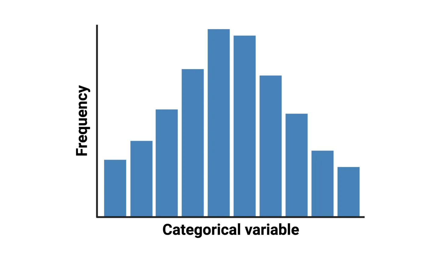
Column histograms are used to represent distributions where the variable has discrete categories. For example, displaying the distribution of age groups within a population. In a column histogram, the column height for each category represents the frequency that the category appears in the dataset.
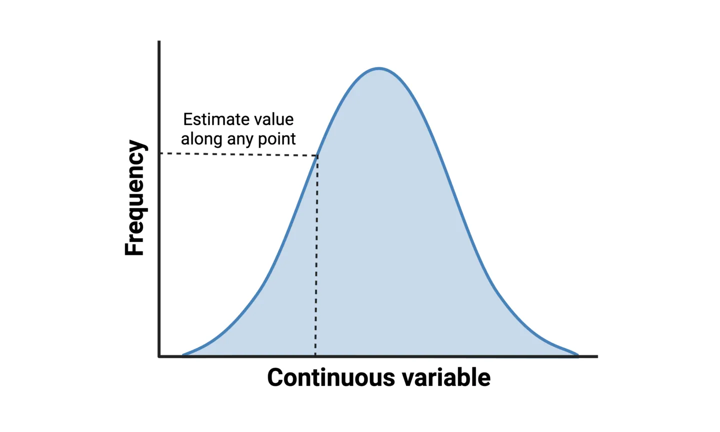
Density plots, sometimes called line histograms, are used to represent distributions where the variable has continuous values. For example, the distribution of patient response time to a certain medication. Density plots use a statistical approach called a “kernel density estimation (KDE)” to show the probability density function of the variable. It is essentially a smoothed version of a histogram that allows you to estimate values along any point of the variable.
Comparisons
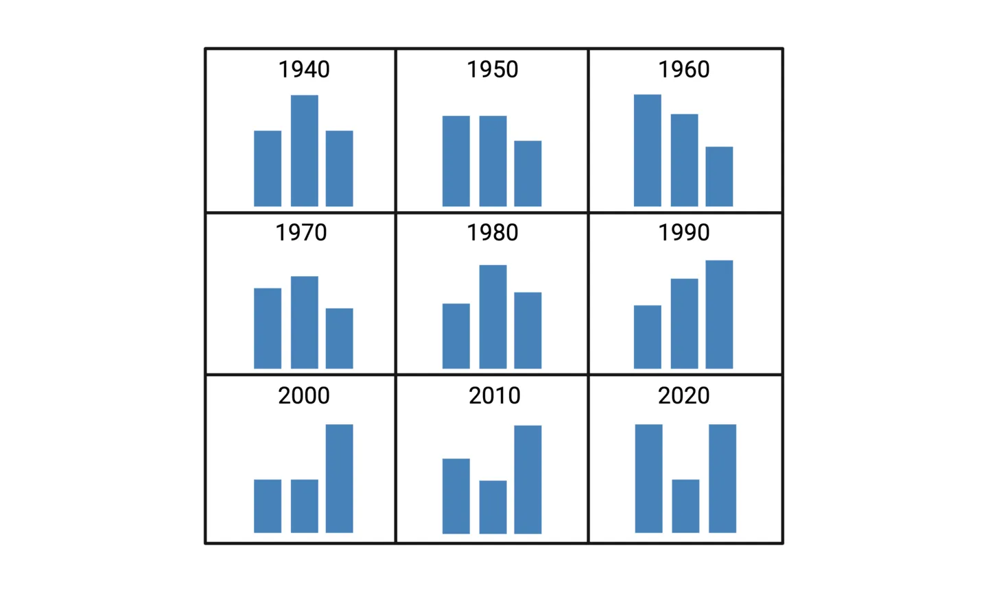
It can often be useful to compare multiple distributions to tell your whole story. For example, in a single histogram, you could show the distribution of age groups within a population. But what if you were also interested in how this distribution changes over time? One solution would be to create a table or matrix that displays multiple histograms.
A histogram matrix, or more generally any table with embedded distributions, allows for this additional layer of data visualization. In the example above, the matrix would be constructed such that our time range is displayed chronologically, allowing for distribution comparisons over time.
How to Visualize Differences
In terms of data visualization, research scientists most often need to depict differences within a dataset. Think about any experimental design that involves control groups and intervention groups being compared across one or two variables. For example, treatment efficacy of a certain drug compared to placebo controls, with the data split by sex. These types of differences are simple enough to depict using column or bar charts. But what if you want to show differences across many variables? Multiple column charts or a matrix of column charts (similar to the matrix of distributions previously discussed) could be an option. But in some cases, more specialized data visualization techniques can enhance your storytelling. Below, we’ll cover two popular data visualization techniques for such cases.
Heatmaps
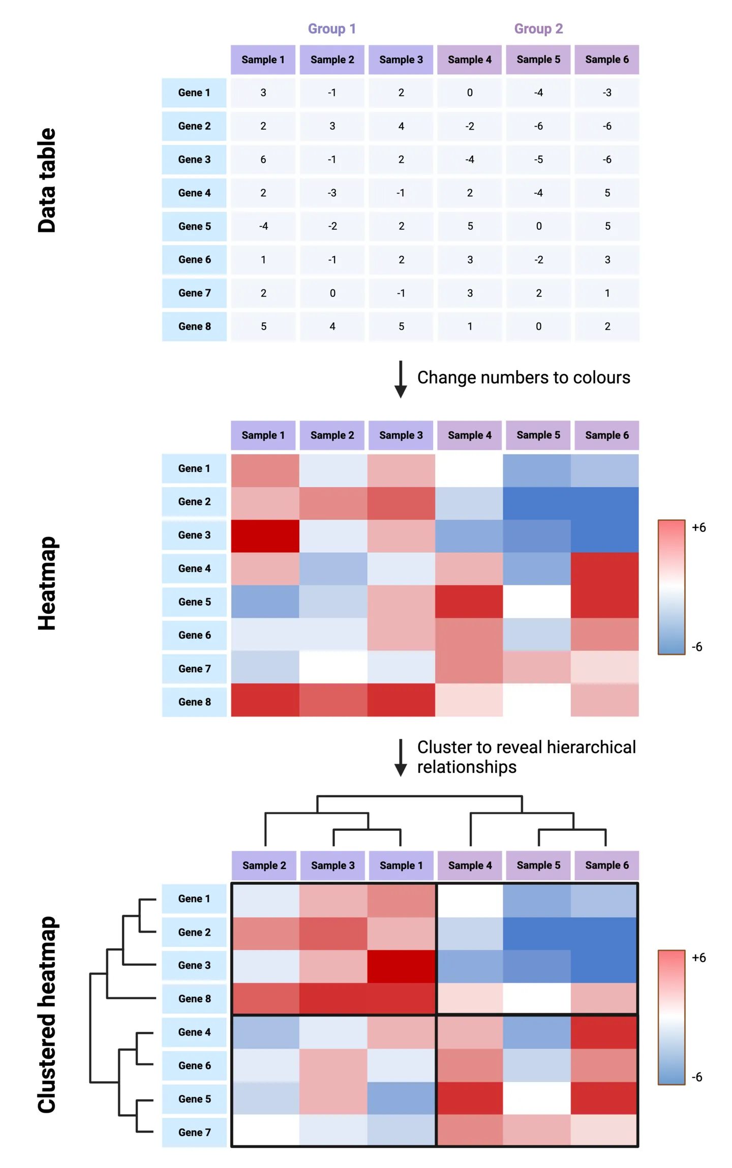
A classic use case for heatmaps is for representing gene expression data, which often includes many genes and many samples across several groups. Because a heatmap is essentially a color-coded table, it will allow for gene expression differences and patterns to be spotted much more easily than a column chart would allow. To construct a heatmap, first imagine starting with a table. In our gene expression example, the samples and groups make up the columns, and the genes make up the rows. Each entry in the table therefore corresponds to the expression of a gene for a particle sample, in a particular group. Now let’s replace the numeric values in the table colors that are coded to depict the degree of over-expression or under-expression. The result is a simple form of a heatmap.
Tip: Further visual enhancement of heatmaps can be achieved by re-organizing the rows and columns to cluster samples and genes based on the similarity of their expression patterns. Dendrograms across the rows and columns are used to depict the hierarchical relationships between the re-organized samples. This helps identify groups of samples that are more similar to each other, which may be important to the gene expression story you are conveying.
Spider Charts
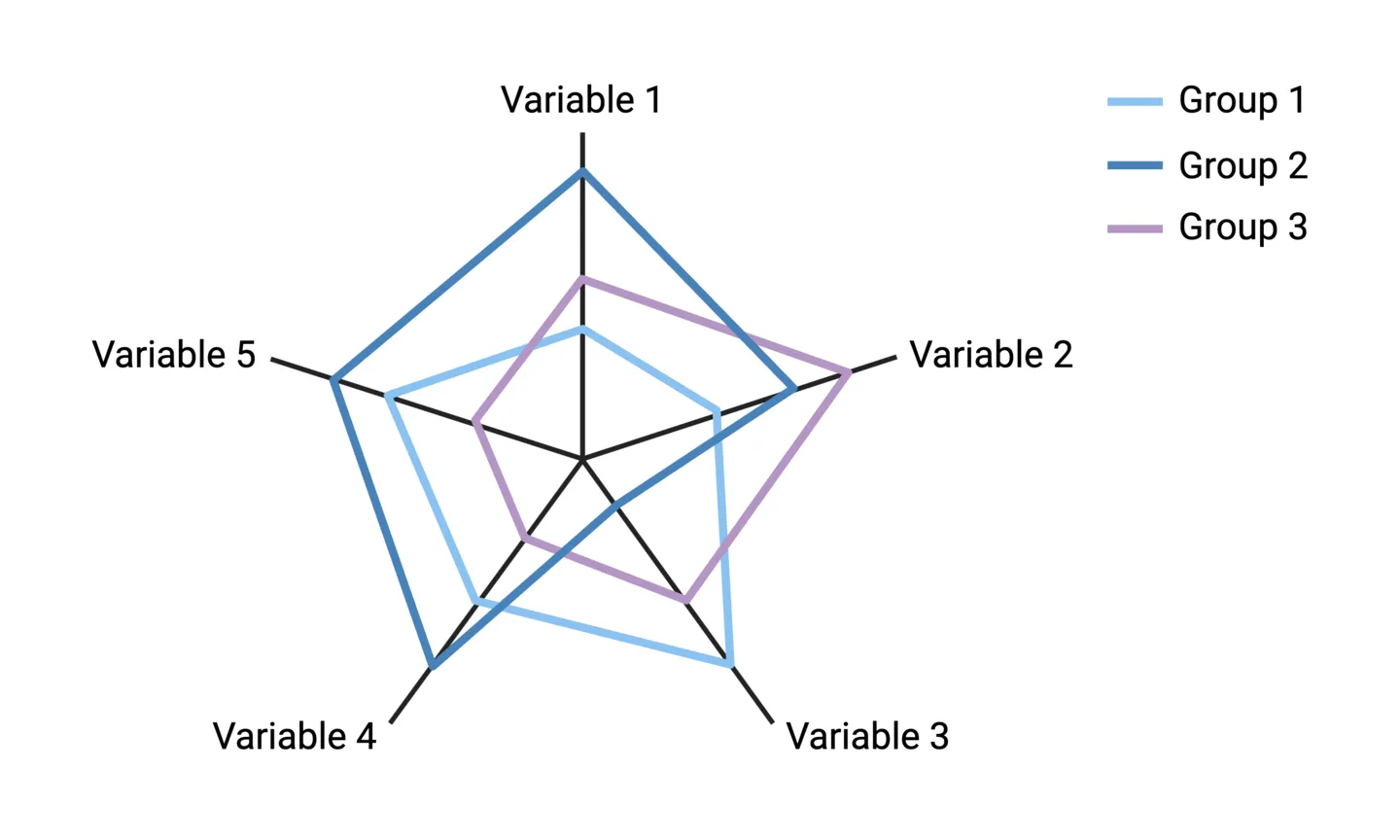
Suppose you want to visualize differences across 3 or more variables for several experimental groups. For example, comparing three medical treatments across five criteria (variables): symptom improvement, onset of effect, drug half-life, side effects, and patient satisfaction. In this case, multiple column charts for each variable would make it difficult to get a wholistic picture of a treatment’s profile compared to others. An alternative approach is to use a spider chart.
Spider charts go by many names, including star charts, radar charts, web charts, and circular area charts. To construct one, axes are drawn for each variable starting from the middle and equally spaced in a circle. The centre represents the minimum value of each variable, and the ends represent the maximum values. The values for the groups are plotted along the variable axes, and a color-coded line is used connect a group’s values across the multiple axes.
Note: the main point of spider charts is to easily visualize overall differences and patterns. Axes don’t typically include numbered scales for precise comparisons, and error bars showing within-group variability cannot be incorporated.
Is BioRender Graph missing something important?
We love to hear our user’s feedback. If you think we’ve missed an important data visualization or type of analysis, please reach out to us at support@biorender.com or click the “Give product feedback” button in the app. Happy graphing!
Read the next chapter | Return to the table of contents
References
- Visualize This: The Flowing Data Guide to Design, Visualization, and Statistics by Nathan Yau


